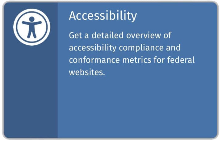
Just a quick note to reflect on something I came across this morning, a “card” on a government website with a link to accessibility information.
The page itself is pretty accessible. HTML_CodeSniffer gives it just 3 red flags at WCAG 2.0 AA — and Lighthouse gives it a 92. So, why am I bugged?

For all the real estate used by the card, just the headline (“Accessibility”) is clickable. Pardon my gamer-speak, but why the small hitbox? There’s an accessibility icon, an explanation, even the rest of the card itself available. So, what’s up with the tiny clickable area?
My guess? It’s a Drupal site and they’re using stock (or mostly stock) Drupal cards. A quick trip to Builtwith and — yep, it’s a D7 site.
I’m going to avoid being to crabby this morning; but just because some open source developer provided a tool (a pretty good tool, too!), doesn’t mean it should always be used as-is. Shouldn’t we step up and improve “cards” and provide the improvement back to the Drupal community?
I’m going with “yes.”